We have a whole new look!

We have a confession to make… Even though we are still (relatively) young, we have chosen to do a facelift. Wait… What?? A new fresh and powerful corporate identity. We cannot wait until this is fully integrated in our company. And of course, we didn’t just create this from scratch, because behind every decision is a powerful story. Discover everything about it in this blog!
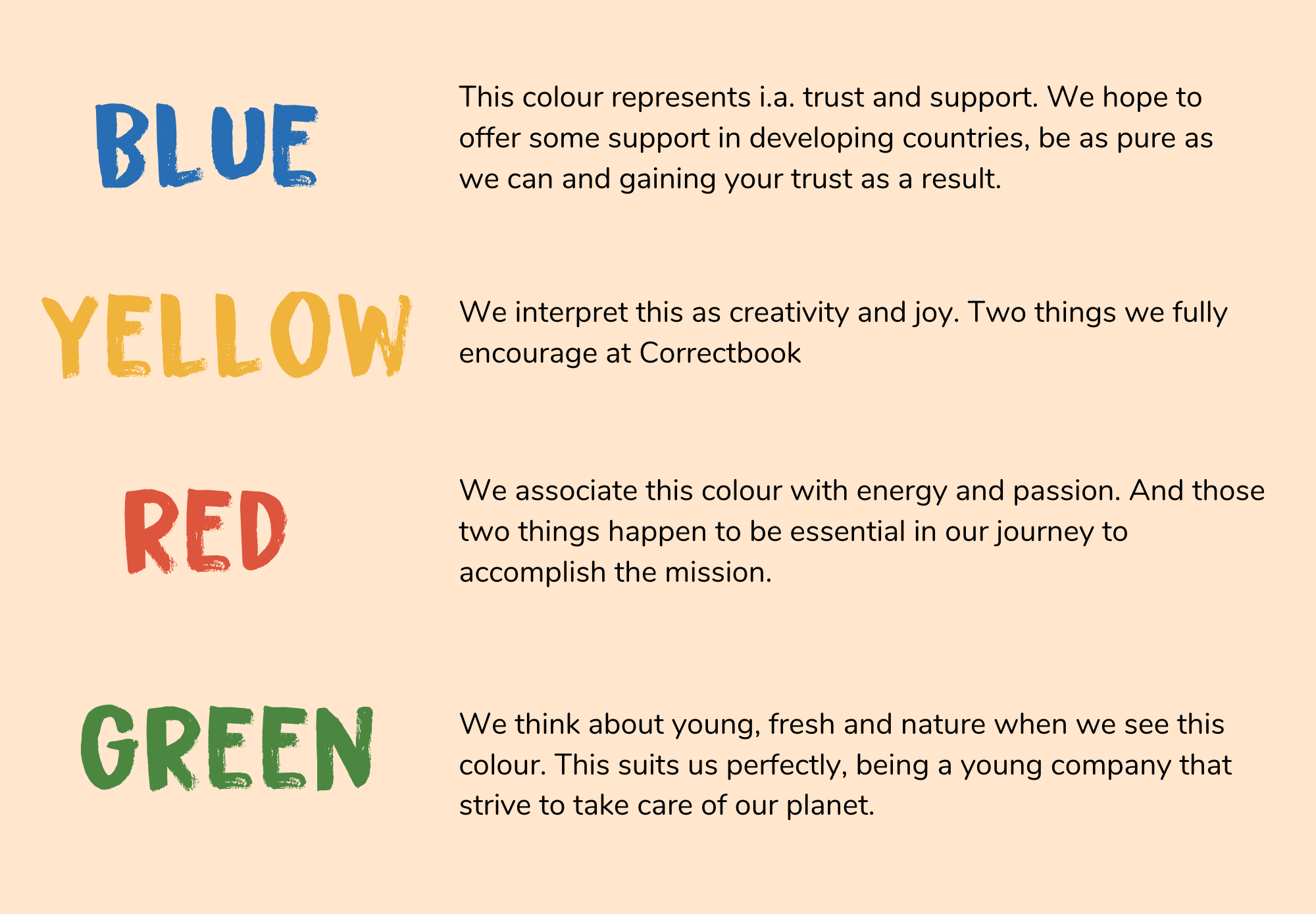
Why new colours? We love to tell you about it. We want to make Correctbook stand out even more with these beautiful colours. They did not just come to us out of the blue (although blue is one of them), these PAN-African colours are very familiar in Africa and these colours are frequently used in the flags of African countries.


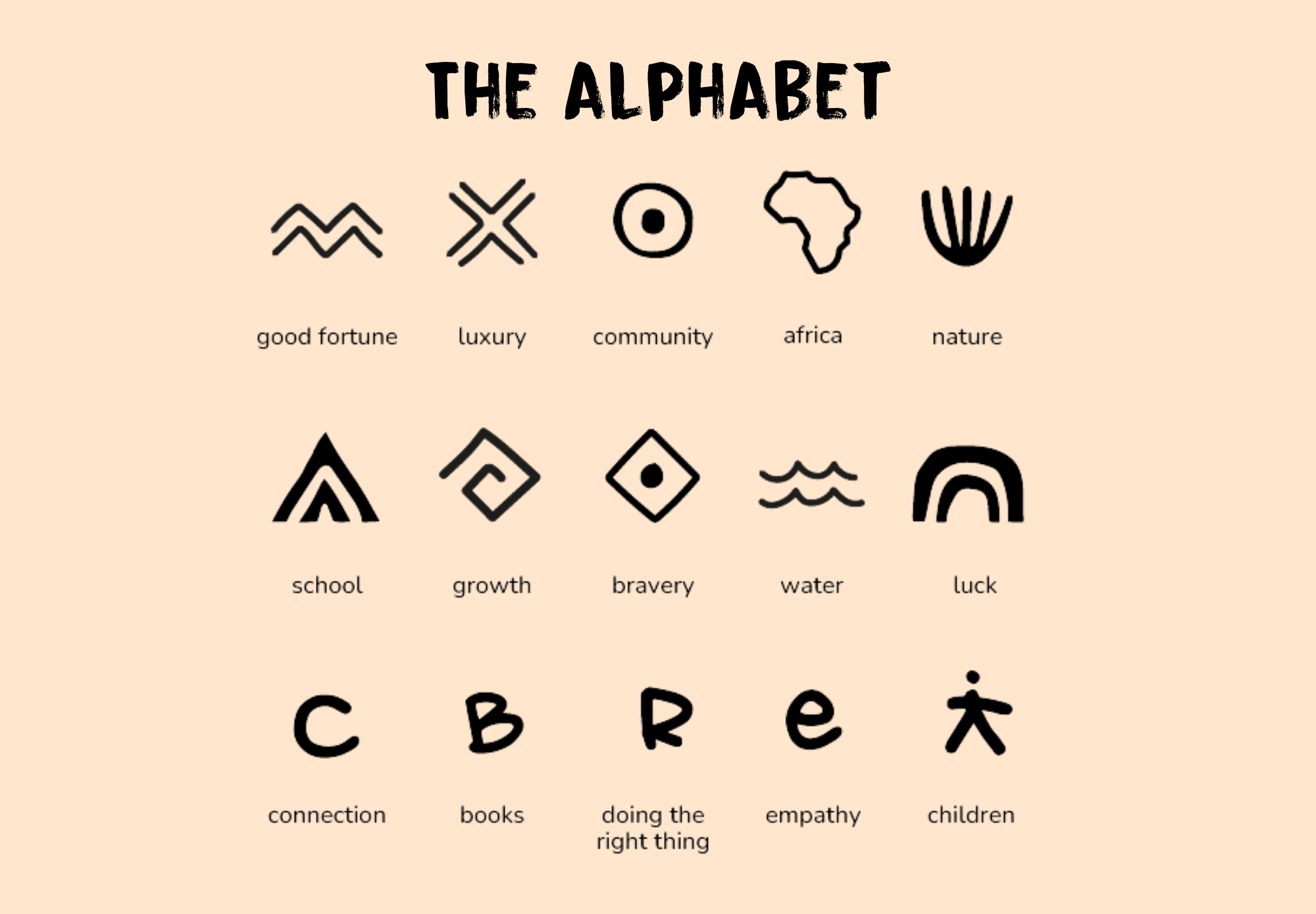
Did you already spot our icons? You will definitely see these more often! They fit our brand and mission perfectly. What do they represent? Find out below. Actually, the drawings of the youngest Correctbook users in Rwanda gave us inspiration for these beautiful designs. 'Cause if you can't read and write, you can still express yourself with icons; perfect, right?
Disclaimer: despite having this awesome new look, our character will remain the same. In fact, we hope to communicate our mission even better with this new style. Our battle against illiteracy will continue. Read all about the impact we made so far and more importantly, the impact we still want to make!
Got all excited about Correctbook? Order yours here!


